
Easy Callout/Contrast Charts
Use this simple data visualization technique to bring clarity to your charts
and keep your audience focused on the relevant data.
Creating Callout/Contrast Charts in Keynote 6.x/7.x
Updated 6/20/2017
Overview
Every Keynote theme includes at least one - and usually several - six-color Chart Style palettes. These palettes are often signature extensions of a given theme, and are highly coordinated to present six distinct series at once - that is, they allow for visual distinction between six different series alongside each other by use of a legend element or some other labeling that distinguishes each series from each other.
This is the default behavior for all charts in Keynote, and if you're looking at a snapshot of concurrent data for two or six different regions at once, for instance, this is precisely how your data visualization should be approached. But if you're wanting to focus in on a single region, it can be difficult at times for your audience to hone in on a particular series when they're presented with so much color at once. No matter how well modeled the Style palette is, it requires some effort to "tune out" the other colors to focus on a specific series.
In these cases, it's helpful to employ the Callout/Contrast method, sometimes referred to as Series Highlighting. This visualization technique neutralizes the surrounding series colors to effectively treat the series you're focusing on as the "Callout" or highlight data that should be focused on.
Our latest theme releases - Geneva and Pavilion NXT - include a Tonal Greyscale Style palette designed specifically for this purpose, but Apple includes their own greyscale style defaults in Keynote 6.x/7.x, so you can apply these same principles to any theme you happen to be using.
Let's take a look at the process for making your own Callout/Contrast Chart.
The Basics
We're using our Geneva theme for this example, but again, you can use Apple's default greyscale palette to employ this technique in any theme you're using. The first method we'll use works best on White backgrounds, which provides the best contrast range for the entire greyscale palette - if you're using a theme with a colored background, you'll want to use the Alternate method detailed further below.
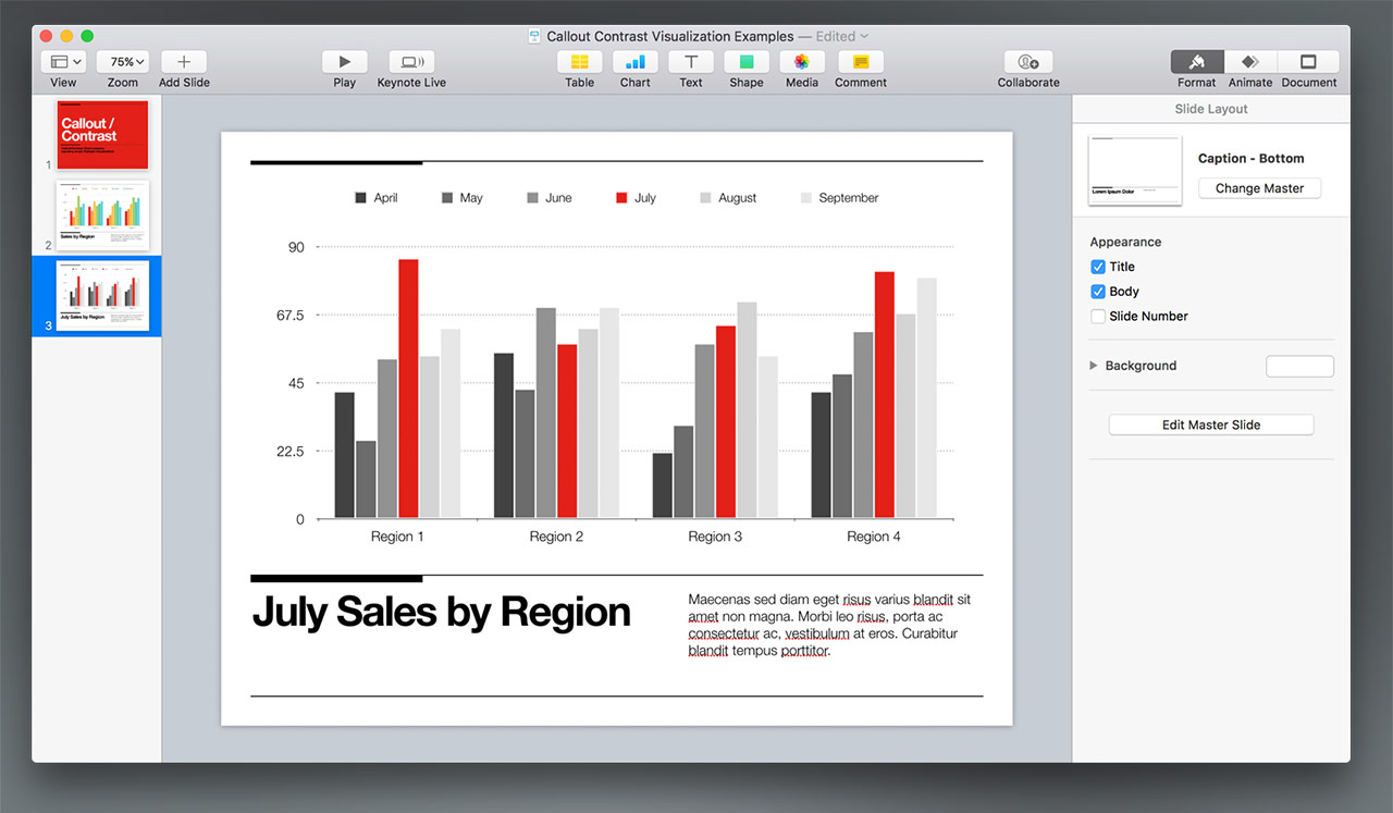
We'll start with a simple, standard 2D Column chart setup, including six month's worth of data for four different regions, with a legend:
Pretty straightforward - it's a colorful, full-spectrum palette, allowing your audience to use the legend to identify and key in on any of the six series independently. And if your focus is on all six months as aggregate data, this would be a good place to stop.
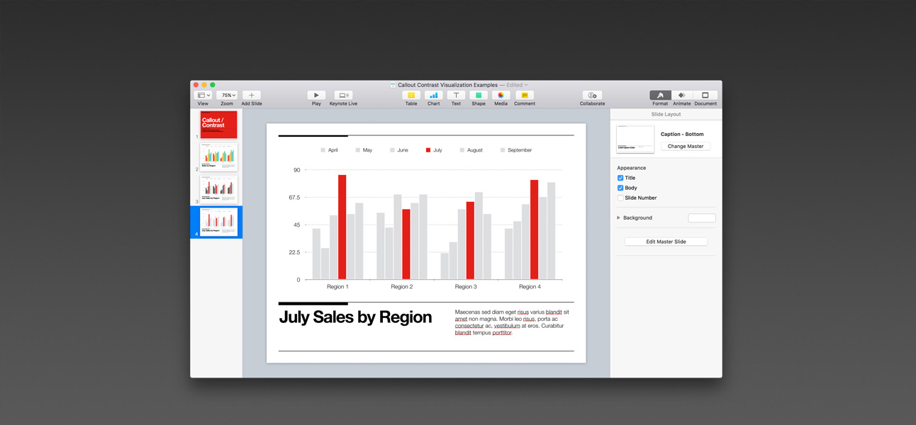
But if we change the context ever-so-slightly, and presume we're looking at any one region as a point-of-focus, suddenly all of that color becomes something of a distraction. We're simply changing the slide title here to make the point - does this feel like the clearest way of having your audience focus on July's data?:
(Click to Enlarge)
In context, the abundance of color is incredibly distracting from the point of the slide. Fortunately, there's something we can do to easily clear this up and make July's data the apparent focus of the slide.
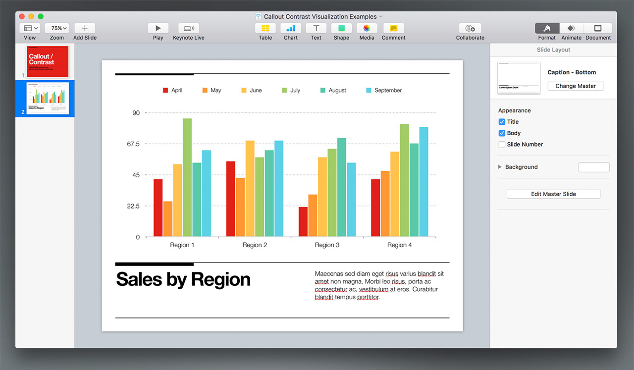
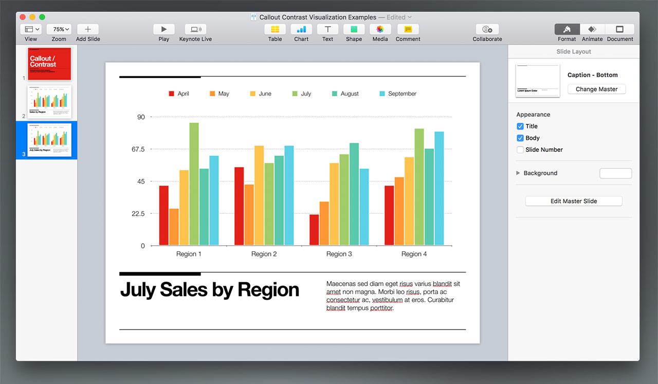
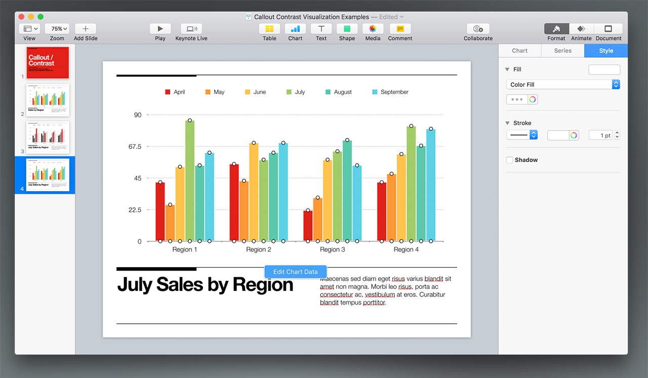
Select the chart, and be sure the Format > Chart tab is highlighted to make the Chart Styles palette visible:

(Click to Enlarge)
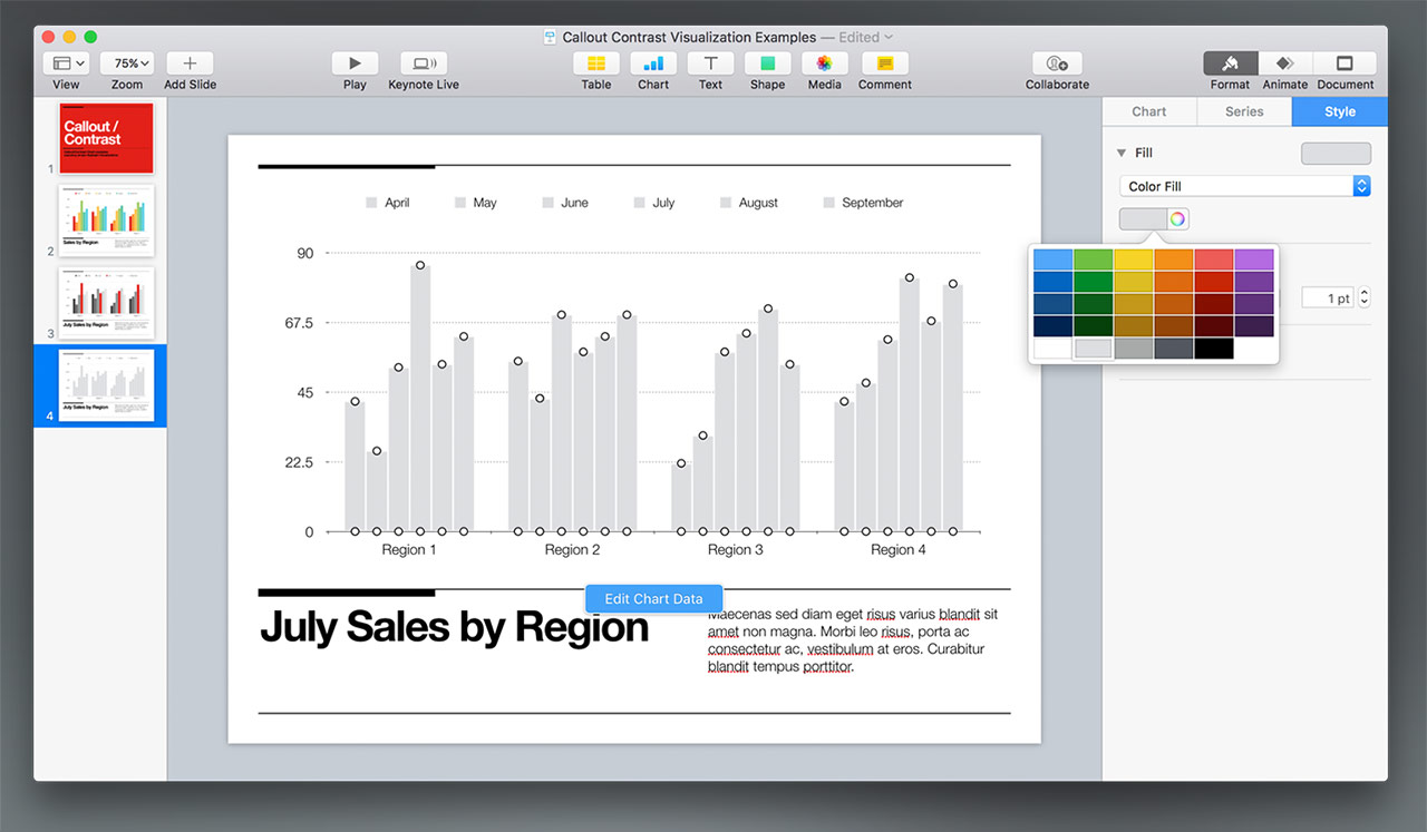
Now, we'll apply the included Tonal Greyscale palette to neutralize the color. If the theme you're using doesn't include this palette, apply Apple's default greyscale palette via the Chart Colors selector further down (on the second panel of options that are exposed when you click):

the color. (Click to Enlarge)
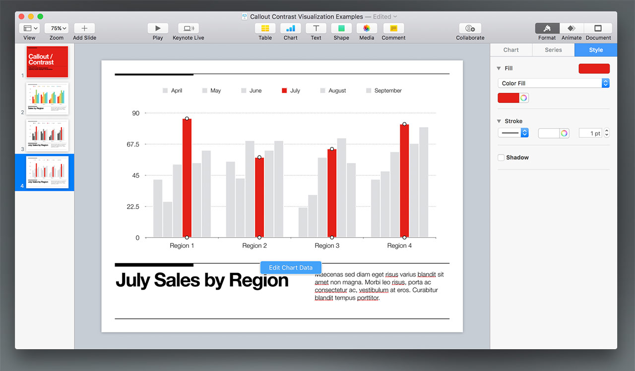
Now, with the chart selected, we'll click into the July column and set the color fill to a Highlight color. Here, we're using the theme's signature red color, but if you're stepping through a series of each month's data using this technique, you could also sample the original color used for the series in the original color palette to keep each slide distinct. We're only looking at July, though, so we'll go to the signature color to keep things coordinated:

We're left with July's data being the clear point-of-focus on the slide. And since we're using a tonal palette, your audience can still distinguish between the surrounding months as needed via the legend and each series' subtly distinct color.
Alternate Method: Flat Neutralization
The basic conversion is a big improvement from our starting point - July is clearly the point-of-focus, and the Tonal Greyscale allows for some level of distinction to be made from each of the surrounding months. But we can actually make this even clearer, provided we're not worried about the surrounding months being strongly-typed to the legend.
This method is actually a better choice for Callouts appearing on colored backgrounds, as you can select a tonal variation that accents/contrasts the background color in situations where basic greyscale doesn't provide the proper contrast or otherwise clashes with the background color.
We're duplicating our original slide here again - select the chart, and click on the Styles tab. Then, shift-select the first & last series to select all of them at once:
With all of the series selected, choose a fairly light neutral color - in this case, we're using the lightest grey in the default color selections (expand by clicking on the color itself instead of the wheel icon):
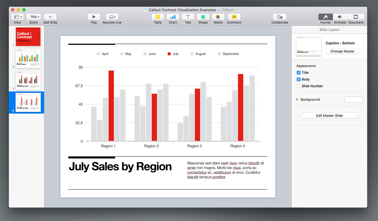
Now, like before, we can select July's column and add our Callout color to just that series:
And you're finished. This is arguably the clearest representation of July's data as a focal point - though your audience will have to do a bit of counting to determine how your Callout data compares to May, for example, that comparison would be theirs to make on their own and not the explicit point of the slide.
Additional Thoughts
This technique is an easy yet powerful way to draw your audience's attention to a specific series within your data. You can take it further by employing the Alternate Method as a baseline, and introducing a second color to work in Contrast to the first in order to visually compare the two series in context of the broader data.
Though we've only explored 2D columns here, this can be an invaluable technique when you're using other chart types - such as the 2D Line chart - where individual series are even more difficult to distinguish from the default aggregate coloration. Anywhere you'd like your audience to focus on a particular series amidst the broader data, do away with the excess color and make it easy for them to zero in on your data with a simple Highlight to draw their attention precisely where it's needed.
This page will be updated as more information is available. Last Updated 06.20.2017


